
Scaling a Heritage Brand with Strategic CPG Branding and Packaging Design
- USATILITY

- Feb 21
- 2 min read
How do you take a wellness brand with a decade of history and over 500 unique products and make them feel like a modern market leader? This was the challenge Honestly Essential brought to USATILITY. To compete with minimalist giants like Aesop and The Ordinary, the brand needed more than just a new logo; it needed a complete visual infrastructure.

The Role of Color Theory in CPG Branding and Packaging Design
When managing a massive catalog, design must be both beautiful and functional. For this project, we didn't just choose colors that looked good; we chose colors that communicated.
By applying specific color theories to each product category, we created an intuitive shopping experience. For example, the use of nude and skin-tone palettes for tallow products emphasizes "bare-bones," natural ingredients, while classic red and blue identifiers provide instant recognition for first-aid items. This strategic approach to CPG branding and packaging design ensures that even with 500+ items, the consumer never feels lost.

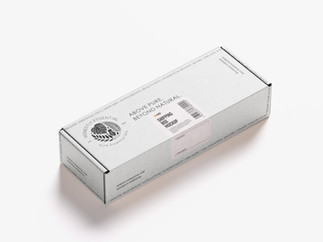
Modernizing the "Apothecary" Aesthetic
To achieve a "luxurious but simple" look, we moved away from dated labels in favor of an off-white, high-texture finish. This transition allowed Honestly Essential to reclaim its status as a premium heritage brand while appealing to the modern, design-conscious consumer.

Why System-Based Design Matters for Growth
A successful brand revamp for a large-scale inventory requires a "system-first" mentality. Our work didn't stop at the label; we provided art direction for ongoing product launches and video campaigns to ensure the new "soul" of the brand was consistent across every touchpoint.
The result is a brand that feels unified, premium, and ready for the next decade of growth.
Does your product line need a visual system that scales? Explore our "Unboxed" and "Makeover" services at usatility.studio to see how we can modernize your brand identity.


Comments